All About the UW Seattle Bus Map
Description
For our final project in GEOG 328, we decided to make a web map showing live-updating positions of buses in Seattle, specifically those that go to and from UW. We chose to display the following routes: 43, 44, 45, 48, 49, 65, 67, and 70. The position data comes from the authoritative source for real-time data, King County Metro.
Goal
We intend for this web map to be used as an attractive and realistic display of real-time bus positions in and around the UW Seattle campus. While this web map doesn't have all the bells and whistles of a mobile transport app, its responsive design provides accurate information about buses that might be of interest to UW students on the go.
Main Functions
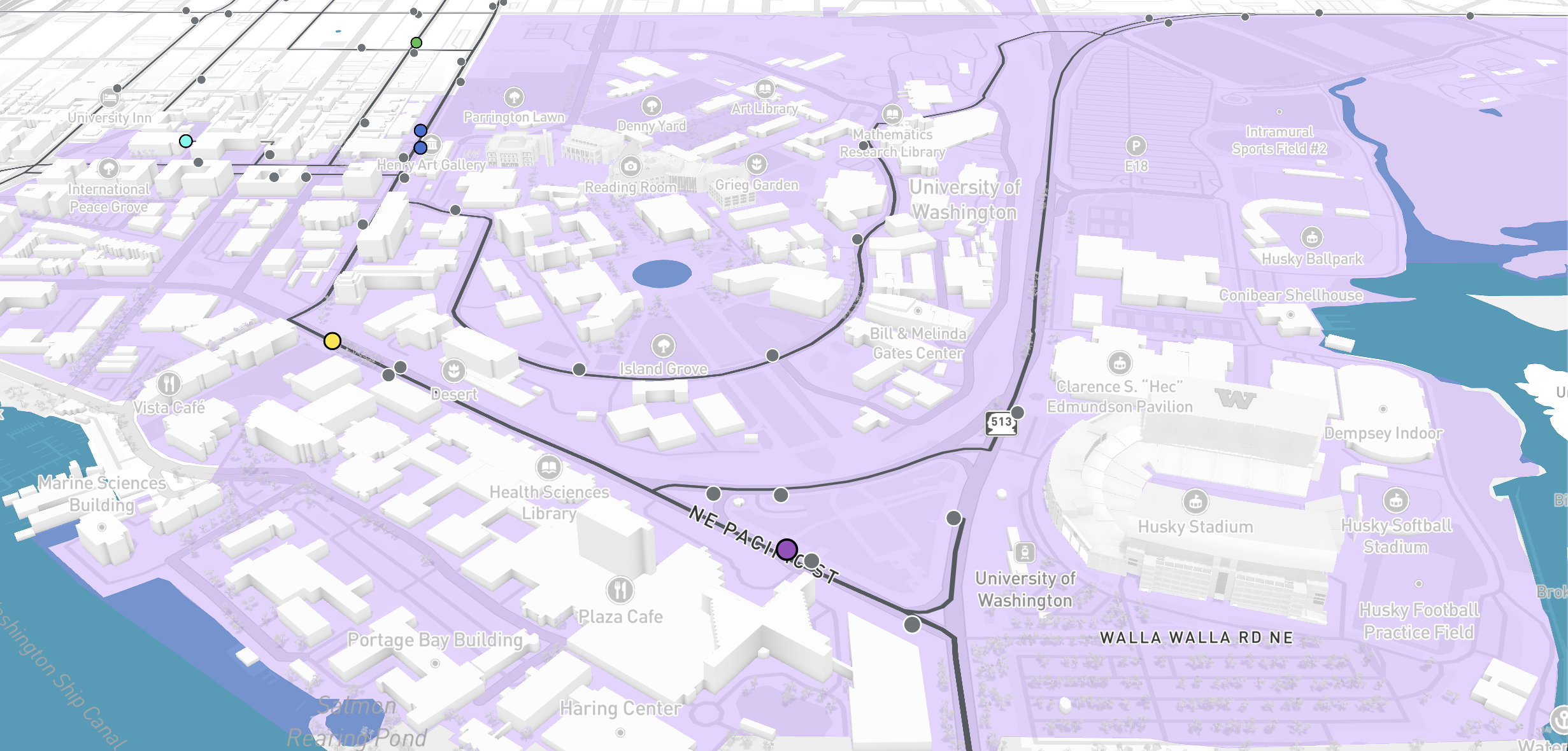
When users first load the web map, they will see a map consisting of a custom basemap centered over UW Seattle and the University District, featuring the 8 bus routes listed above.
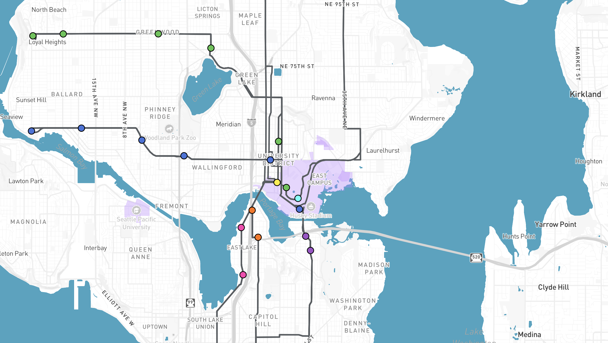
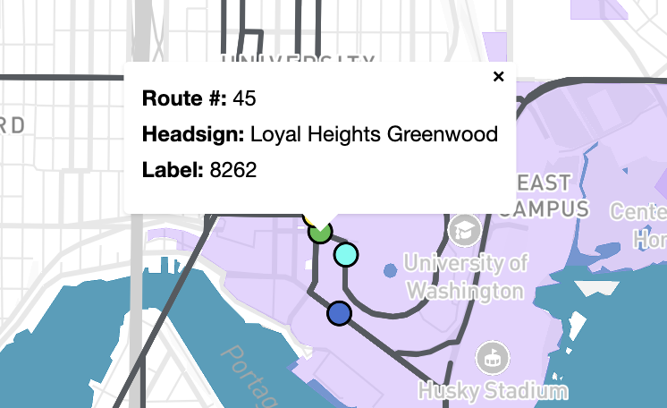
On the bus routes, moving circles represent the current positions of buses on the routes. The positions of these circles are updated every 7 seconds. The moving buses display a pop-up that shows their route number, headsign(s), and label when clicked. This pop-up tracks the position of the bus.
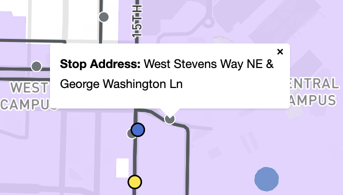
When users zoom into the map and reach zoom level 14, they see bus stops along the routes, which are represented as gray circles. The bus stops display a pop-up that shows their address when clicked.
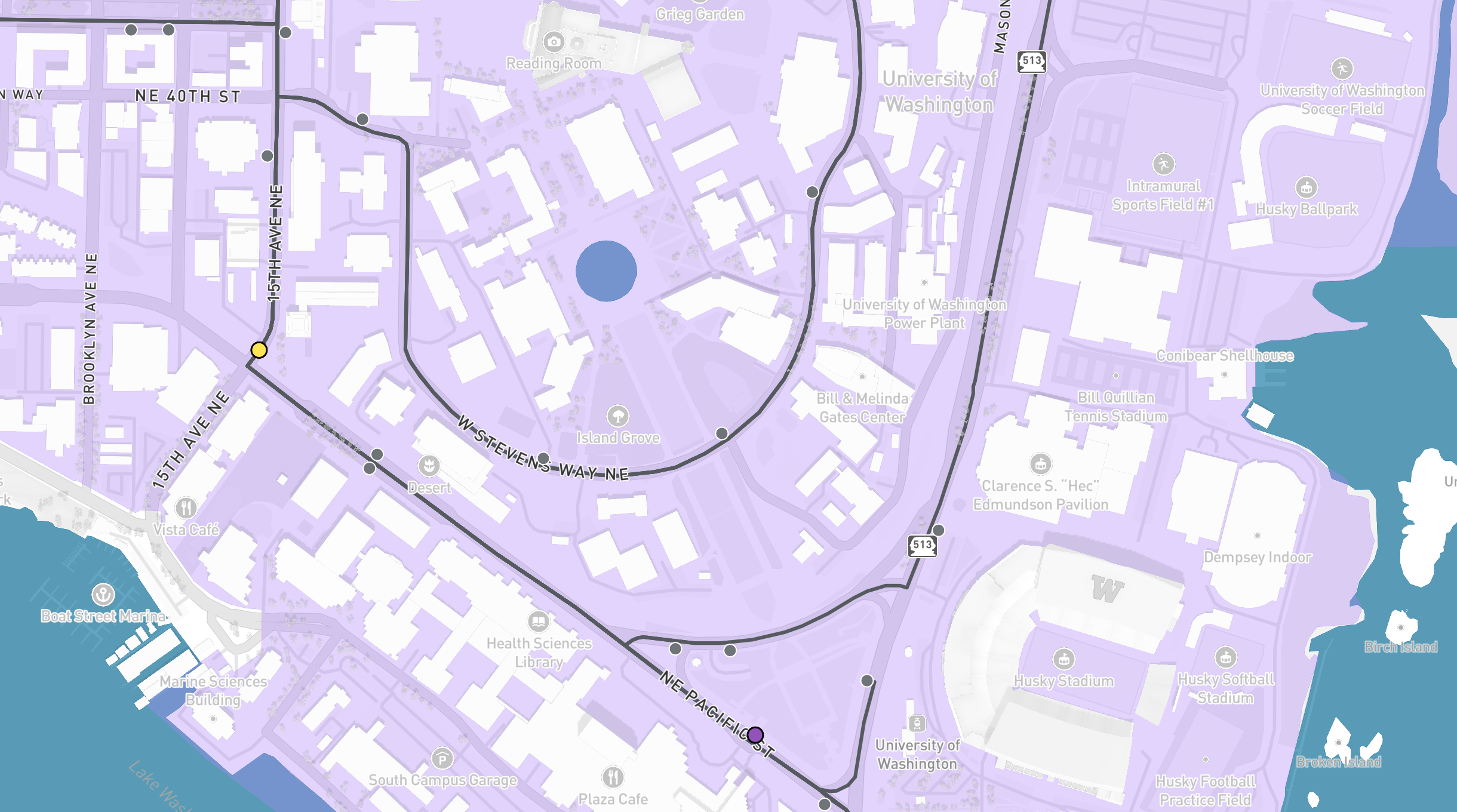
At zoom level 15, users can see buildings drawn in 3D. By holding CTRL while dragging the map, users can add tilt and rotate controls to the standard pan and zoom motions. These additional controls alter the shading of buildings based on view angle.
To the left of the map, there is a menu with 8 buttons, one for each route displayed on the map. The buttons are color-coded to match the moving bus points. By clicking on a button, users can highlight one route at a time in its specified color and the bus stops associated with the route. All other routes and bus stops fade.
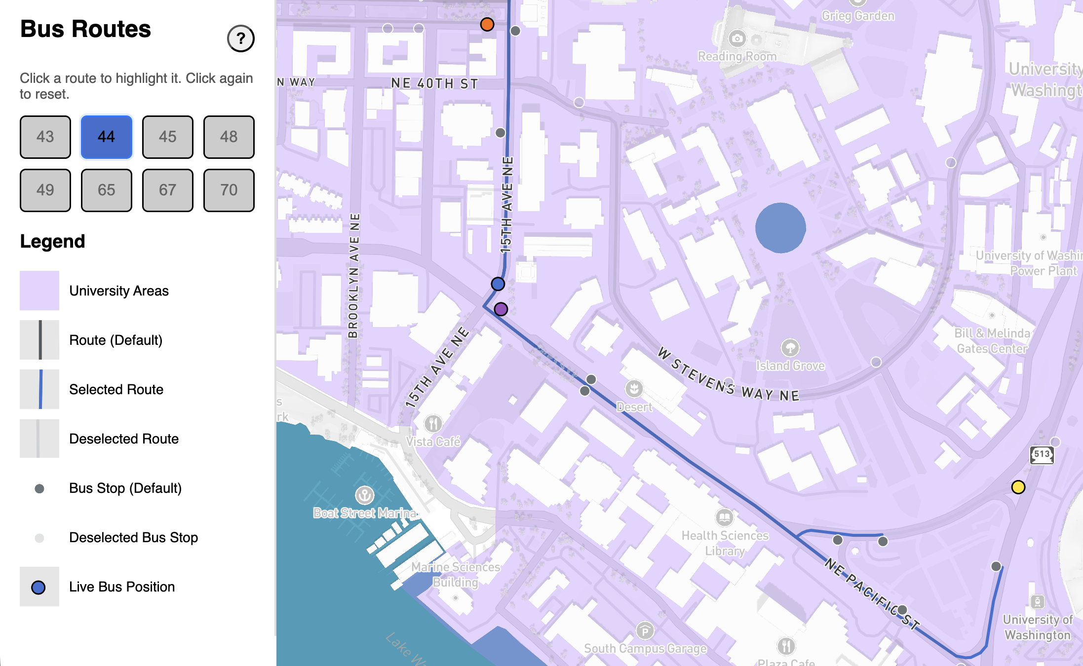
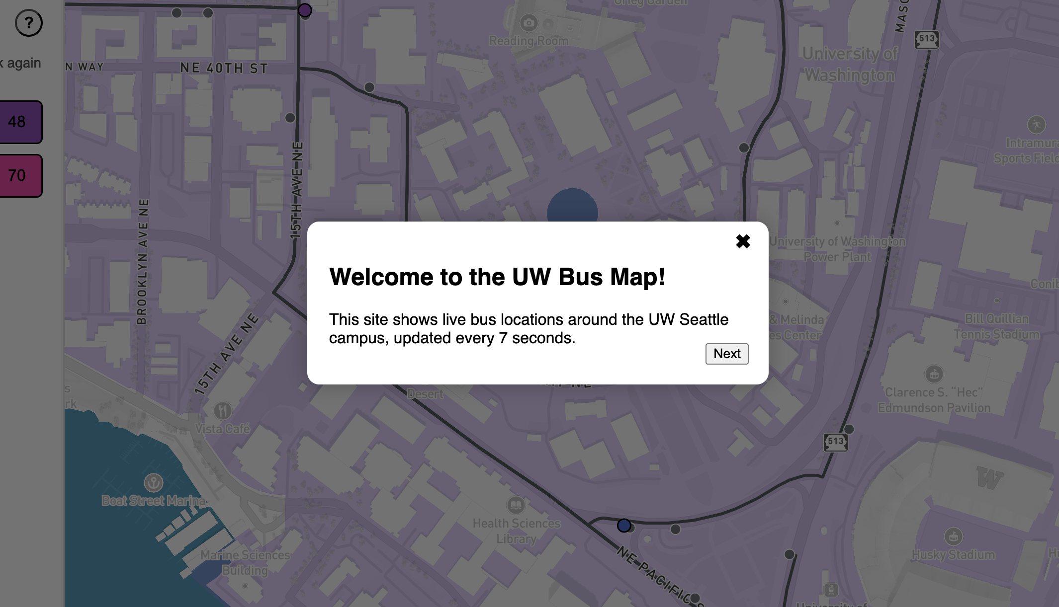
The menu also includes a button labeled with a question mark. By clicking on this button, users can get a quick tutorial on how to use the map.
Data Sources
Our web map utilizes General Transit Feed Specification (GTFS) data from King County Metro that comes in two forms: static and real-time (GTFS-RT). The static GTFS data is a collection of 11 CSVs represented as .txt files that describe a variety of characteristics for King County Metro Transit Services, such as scheduling, fares, routes, stops, and trips. The GTFS-RT data comes from King County Metro’s AWS S3 object, which we pull from every 7 seconds. The data that comes from the link describes the live positions of individual buses for all of King County and is in JSON.
Applied Libraries, Plugins, and Webservices
Mapbox GL JS
We used Mapbox GL JS to create the map itself. Through Mapbox commands we were able to add a customized basemap and conditionally format the aesthetics of routes, bus stops, and moving buses.
QGIS GTFS-GO
We created the GeoJSON layers for the bus routes and stops by feeding the King County Metro .txt files into a QGIS plugin called GTFS GO, which transforms GTFS .txt files into GeoJSON.
CloudFlare
Due to a Cross-Origin Resource Sharing (CORS) restriction, we were not able to pull from King County Metro's AWS S3 object directly. To work around this, we used Cloudflare Workers to create a third-party proxy that helps us pull data indirectly.
Acknowledgements
Thanks to Gianna Carlson, Olivia Whitford, and Michelle Tong for helping with browser and device testing.
Thanks to King County Metro for making it easy to access live-updating bus data in GTFS format via an ungated S3 object. This reduced complexity because we don't have to interact with a REST API.
Thanks to Cloudflare for making it easy to set up a CORS proxy without users needing their own accounts or API keys.
AI Disclosure
We used ChatGPT and Copilot to assist with several parts of our project. The following is a list of where we used AI:
- Data preparation
- We used AI to build an understanding of what the GTFS and GTFS-RT data means in the absence of documentation from King County Metro
- We used AI to get rid of duplicate bus stops sequences after joining the necessary CSVs from King County Metro's static GTFS data in R
- We used a ChatGPT-generated Python script to filter the bus stop GeoJSON down to only bus stops that contained at least one of the route IDs corresponding to the 8 bus routes our map is focusing on
- We used ChatGPT to automate the creation of the static JavaScript objects that contain route and bus stop information
- The information in these JavaScript objects were fact-checked against the joined CSV of King County Metro data made in R
- We received guidance from ChatGPT on how to write the methods for fetching the live bus data as JSON, converting the JSON into JavaScript objects, and converting the JavaScript objects into GeoJSON
- We used ChatGPT to edit the GeoJSON of live-updating bus positions to include data (i.e., route number and trip headsign) from the route JavaScript object
- Creating the map
- We received guidance from ChatGPT on how to customize the basemap to highlight the UW Seattle campus and re-arrange the street labels to sit above the bus route lines
- We used ChatGPT to help debug issues with creating pop-ups for moving buses, especially when trying to get the pop-ups to follow moving buses
- We used ChatGPT to style the moving buses based on their route numbers
- Creating the menu
- We used ChatGPT and Copilot to help style the menu buttons in their active and disabled states
- We used ChatGPT to write the logic that enables the menu to only show bus stops along a selected route
- We used ChatGPT to debug issues with creating the tutorial overlay and having it be activated by clicking the help button
- We used ChatGPT to help add a legend under the menu buttons
- Web page layout
- We used ChatGPT and Copilot to make all pages conform to responsive design principles